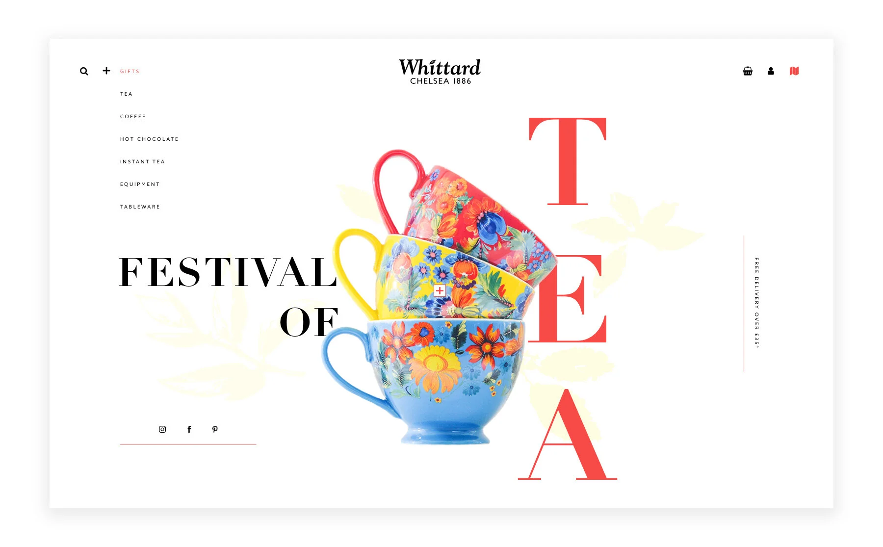
Summer never looked so sweet.
Project:
As a designer, we occasionally come across a product or brand we like and become curious on how our take on it would look like. It’s like an itch we need to scratch - and this project was exactly that.
This is a self-initiated, experimental design concept for one of my all time favorite stores, Whittard of Chelsea. Founded in 1886, Whittard is an international retailer of coffee & tea. I designed this website to highlight their rich history and colorful summer collection.
Agency: Freelance, self-initiated
Role: UI and UX design
Featured: Behance UI/UX 2017
Year: 2017
The home page
By treating their summer chinaware as the brand guideline - which included bold colors and bright floral prints, my goal was to bring a minimal yet colorful approach to their site.
I implemented my signature style of clean lines, faint background illustrations and experimental text/graphic layouts.
Above the fold and mobile experience
The team section
The featured products section
Their collection is inspired by tropical flowers and summer styles. It's a little ode to the beauty of the rainforest. I wanted to display their vibrant products in a minimal setting, making use of simple design elements and bold choices for the layout and positioning.
Overall, I enjoyed fusing my love for tea with design.
Experimenting with my own projects every now and then helps keep my ideas fresh and continuously pushes the envelope of effective visual story telling. I’ve received numerous positive feedback for this project and can’t wait for the day Whittard will actually call me for a collaboration. ☺


